Bedroom - Before
Bedroom - After
The bedroom's new ensuite is black and white so it was logical to use this colour combination and this worked well with the exisiting iron poster bed and antique furniture.
We chose a large graphic pattern for the drapery and a striped sheer for privacy and we brought down the curtain rod to above the window rather than halfway up the wall. The smaller window got a sheer roman blind.
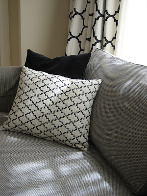
We continue the lattice pattern with the cushions and the sofa fabric, which has a smaller lattice weave. A darker grey for the sofa was chosen to give depth and contrast.
These moves gave the bedroom the 'pop' that it needed.
Photographs by Charlotte Minty.


0 comments:
Post a Comment