Gallery Tattoo
Tattoo
Gallery Tattoo
Tattoo

Saturday, September 24, 2005

VON GLITSCHKA

Von has worked in the communication arts industry for 19 years as a Senior Designer, Art Director and Creative Director. His fresh, exuberant graphics—for both in-house art departments and medium to large creative agencies—have won numerous design and illustration awards along the way.
In 2002, Von started Glitschka Studios, a multi-disciplinary creative agency with clients nationwide, including General Motors, Microsoft, Upper Deck, Hasbro and IBM. Characterized by a diverse range of styles and humor, Glitschka Studios strives to create visually inspiring, concept-driven design in a world often void of alluring and well-executed graphics. The studio has found its niche as a creative outsource for larger ad agencies and design firms. Logo/brand development and illustration work are two mainstays of the firm’s commissions.

http://www.glitschka.com
http://www.baddesignkills.com


When did you first decide to become a graphic designer/ illustrator? Was there a pivotal moment?

My first hint that I might want to pursue this as a career came my freshman year in high school. I took a 'graphic communications' class which taught us how to do layout and paste-up and then carry it through to pre-press and burning plates and then run an off-set press to print what we did.
The first assignment was to design a business card. The teacher told us upfront "These cannot be real business cards. They have to be fake." So I decided to do business cards for a fictitious trucking company and called it 'Bull Dog Trucking' and used a cool bull dog image I found in a ad cut book provided to us. I designed a logo using the bull dog and created the mechanical. Then I proceeded to go through the whole process and then turned in the finished cards to the teacher. He looked at card and said "Hey plumber come here!" I said "Why do you call people plumbers?" Not looking at me and still scrutinizing the business card he said "Because plumbers make more money then I do." I didn't say anything because I still didn't understand how that applied to me? He then looked at me as his brow furrowed and said pointing the card at me "You sure this isn't for a real business?" I shook my head "No. I just made it up." He starred at me for a few seconds not saying anything and then turned around and walked to his desk. He picked up his phone and looking at the business card punched in the phone number I had on it. Since I made up the phone number it gave him a pre-recorded message and he hung up the phone turned around and said smiling "Good work plumber. This looks like the real thing." After that he pretty much let me do anything I wanted so I got to create and print my own little books and flyers etc. it was a lot of fun.
During my senior year my friend Tom Harn and I looked into going to film school but since we had no idea if or where a school was we asked the career counselor to look into it for us. Being that it was before the dawn of the internet she came back with "I couldn't find anything?". So we both kind of let it fade. About a month later a lady from Burnley School of Art (Now Art Institute of Seattle) came in and showed us a portfolio of student work and told us about the college. I knew right then I'd rather go there then do math at a regular four year college.
So essentially my fear and loathing for all things math related inspired me to pursue what I do now. ;-)


Who or what inspires you?

I'd have to break it down into three parts.

Part 1 > Sources of inspiration that Influenced me growing up.

- My mom. She is very creative. Has been doing the 'Martha Stewart' thing way before Martha and she has a better sense of humor.

- Norman Rockwell: My parents owned a book of his art and I'd sit on the couch and just flip through it studying the details and trying to understand what was going on. The depth and richness of his characters transfixed me and many of my doodles at that age were little scenes that I tried to tell the same type of story with.

- Jim Flora: My parents owned a bunch of LP's of big bands with his artwork on it and I'd just stare at it all the time. Took me about 30yrs to figure out how much this man influenced me.

- MAD Magazine: My parents viewed this magazine as 'unhealthy' to a developing mind. I guess that is why I loved it so much! LOL I'd ride my bike down to the drug store and buy a copy ride to my friends house and read it. I'd then stuff it down my pants and take it home and stash it safely under my bed. Sergio Aragones, Don Martin and the like artwork would captivate me for hours. Of course the humor was good too.

- Anything Pop Culture at the time you could find on TV: Sid & Marty Krofft shows, Star Wars, Buck Rogers, Battle Star Galactica, Batman, Johnny Soko, Kung Fu Matinee, Cartoons, Japanese Cartoons and Monster movies.

- I was always exploring too as a kid. I'd take a box, tin foil, markers, tape, an old motor from a toy I took apart and would spend the day creating a robot. That is it looked like a robot. Or me and my buddy Tom Harn would write scripts and do movies with his dads 8mm film camera. That took up a lot of my childhood.

- I first touched an Apple computer my freshman year in high school. An Apple II. I taught myself basic and eventually got to the point where I was programming my own software to catalog my baseball cards and creating a path adventure game. Even time I see a file and it's size is 64k I laugh because it reminds me of the Commadore 64 computer from those days.

Part 2 > Sources of inspiration that influenced me professionally.

- Neville Brody: I remember when I first saw his work thinking "You can tell it's his work." I liked that. It told me his work had a voice that reflected himself even though it was successful for his client too. He was part of my own design revolution in that regard.

- Fred Griffin: He was my eccentric graphic design teacher in school. At the time I didn't appreciate his '8 Basic Design Principles' he methodically taught us. But over the course of 19 years they've proven themselves to be fundamentally true. Me and another former student are working on getting a web site published with this methodology online as a resource for other designers.

- William Morris: I came across a tapestry book of his work early in my career and it fascinated me. Here he had created these complex textile patterns and motifs all by hand without any digital precision tools but they were not only beautiful but impeccable from a precision stand point. That told me that a high level of skill and craft for your work should be a must. And with the help of computers now there is no excuse for sloppy work either conceptually or execution wise.

- Apple Macintosh: I learned design the 'old school' way and I am really glad I did. The first 4.5 years of my career were non-computer and frankly I didn't take it too seriously. When the MAC came on the scene strong and due to my previous exposure to Apple II I naturally jumped on it and have never looked back. I guess it facilitated and helped unleash creative opportunities that I otherwise never was able to pull off. I love hi-tech stuff and this mixed two passions for me 'Creative' and 'Tech'. Hence why I consider myself a true 'Mac Geek'.

Part 3 > Sources of inspiration that currently influence me

- I try to live a 'Creative' life style. I am always exploring. Always seeking. Always capturing passing thoughts and recording them. Saving all my doodles. I have fun with this with my two daughters too. Just the other day we had a conversation about the branches of a tree by our house and how they look like a monkey sitting up in it. I try to remain curious about topics and things I don't know. I am always trying to learn new things and that alone inspires me on new paths etc.
- Other designers work who I consider friends inspire me. My close friend Paul Howalt (www.howaltdesign.com) blows my mind with his work. I've become friends with a designer in Portland named Jeff Pollard (www.jpd-logos.com) and his work intimidates me and I like that. Intimidation is a passing moment for me and transforms into inspiration which motivates me to kick it into gear and expect a higher level of work from myself. Another is Keith Bowman (www.designbureauofamerika.com) I've enjoyed getting to know him more and not only is his work incredible his humor cracks me up as well.

- Randy Hill. A while back my friend Tyson who is my CPA told me about this designer who moved to Salem from Texas and said I'd probably enjoy talking to him. So I contacted Randy and we met for coffee and man what a cool guy. I now feel like I have another designer friend locally I can just talk shop with and hang out with and he'll understand the whole creative thing. He's also a gifted musician so I am hoping he'll inspire me musically too.

- Doodles. Some may not see how that could inspire but it's like 'Brain Dumping' for me. I literally save all mine and when I go back through months or years later it's like meeting an old friend you forgot about. I find myself thinking "I remember you! You were fun." Doing this has inspired my latest side projects with http://www.doodlearchive.com and http://www.keyboard-characters.com.

- Creation. I read several scientific journals and I am fascinated with the level of design that can be found in known systems. it's cool when I see designers who observer nature and then mimic that design to create a new product or design of their own. I remember seeing the intricate patterns and wonderful colors on a tropical fish and thinking "Thats part of Gods portfolio."


Where does your training come from? Self-taught? College/Art School?

Growing up I had no formal education for art. I've always drawn since I was really young though. I attended Seattle Art Institute from 1984-86.


How do you keep "fresh" within your industry?

Always learning. Always exploring. Always trying new approaches. Always feeding my mind. I get bored easy and staying focused is a big challenge for me every day so the way I help myself do it is to approach my work without any preset assumptions as to how I will pull it offgraphically or otherwise. I let the creative process dictate my approach.
I also pursue a very diverse amount of projects. One day can be a pure illustration project, the next could be web development work, then icon designs, and then a logo and identity design. I like that, it keeps it fun and interesting.


What are some of your current projects?

September and October are always my slowest times in terms of work flow. So right now I am working on my new illustration web site. I pulled my old site down over two years ago so this one is way over due. My goal is for an early November launch. I am about 60% done right now. It uses a new domain name www.vonster.com.

An ongoing project now is creating a set of 60 icons for Edison Power in California. When I work on a set this big I usually try to collaborate with another designer to pull it off in a more timely manner and on this project I am teaming up with another icon artist out of England.

I am also working on local telecom companies branding for another agency here in Oregon.
This coming week I'll be starting a interactive flash component for a company in Seattle for use on their web site.


Which of your projects are you the most proud of? And why?

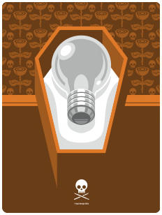
Right now I'd have to say the 'Bad Design Kills' web site. The whole thing started as something just for fun and it's kind of taken on a life of it's own over the past six months. I cannot take full credit for it's success however. The contributors to the site are the ones who should get the most recognition for it's success. It's their artwork that visitors are downloading and enjoying and that has led to it's popularity. The image you have posted with this interview was created by my friend Brian Brasher. Arguable the best icon artist in our industry in my opinion. it's work like this that makes the BDK site a success. This one I'll be uploading soon to the site so the readers of this blog get a sneak peek.


Are there any areas, techniques, mediums, projects in your field that you have yet to try?

Film: I'd love to create a documentary idea I have. I just need to make the time.
Childrens Book: Hard to get your foot in the door but I'll pursue this too at some point.
Music: I am trying to learn the guitar. Hard when you have fingers like a hobbit.


Any advice to the novice designer/ illustrator?

Anyone can learn software. Train your brain to become good solid conceptual thinkers. When working on ideas nail it down on paper through a methodology of sketches and refinement before you jump into the digital realm. Become a good doodler. You don't have to be a full-blown illustrator but teach yourself to be a good sketcher so you can work out ideas and visuals easier and more effectively.


What makes a designed piece or illustration successful?

Good design without a concept is nothing but decoration. And a concept without good design is mute.


What do you do to keep yourself motivated and avoid burn-out?

Coffee. Lots of coffee. Seriously though, I always make time for my own pet projects. So during the day I may be working on a clients project but in the back of my mind I am thinking about my project I can pick up with where I left off. I usually move from one pet project to the next and right now have several in the fire at the same time.


And finally, what is the best thing on prime-time TV right now?

My iPod has really limited my TV viewing. My top five shows would be:
- Myth Busters
- American Chopper (Mikey cracks me up)
- History Channel (Anything WWII)
- Grim Adventures of Billy & Mandy
- Everybody Loves Ramond (Reruns)

Related Links:

http://www.glitschka.com
http://www.baddesignkills.com

Recent Work:


Thursday, September 22, 2005

JEOPE WOLFE


Jeope Wolfe (pr. JOE-pea) is a boy, and an in-house graphic designer at Ducks Unlimited Canada’s national headquarters outside of Winnipeg, Manitoba. He has worked…nuts to this third-person shtick; I’ve worked here in various capacities since 1998, nowadays primarily designing and overseeing the company’s members-only magazine, Conservator, and its french-language equivalent. In between issues I slog away on internal company requests and other corporate detritus.

I dig what I do, and I’m fortunate to be in the position I am, being where I am. I’m a fan of the whole scene. Show me anything artistic and chances are I’ll appreciate it.

Interests vary widely, including road maps, thunderstorms, taking photos, barbecued meat, vegetarian pizza and lasagna, birds, biking, hiking, exploring and my new house.

And I’m almost 30 years old.

If you’re headed to the Arctic, stop by Winnipeg. I’ll show you around, have a good time.

-----

When did you first decide to become a graphic designer/ illustrator? Was there a pivotal moment?

For a few years in junior high I wanted to be a cartographer, which is close. But realistically, it didn’t happen until I was in college. I was taking an advertising and journalism program. I wanted to be a print journalist, but at the same time we were covering the local police beat (depressing!) we were learning how to create and write TV storyboards in advertising (non-depressing!). So that day I totally switched teams. The following year, majoring in advertising, I worked in conjunction with the design students on mock campaigns and what-not. They seemed to be having even more fun, so I finished up my course and enrolled in the design program. And – with no offense to the field – it just seemed really easy. I had to scratch and claw to get decent marks in journalism and advertising, but I was making the honours list in design almost every term. And getting more sleep.


Who or what inspires you?

I don’t have a hero or nuthin’. No Saul Bass posters on my bedroom ceiling. But seeing kickass work in the CA annuals, online, in publications? That inspires me. When the CA annuals come in the mail – especially the photo annual – it’s like Christmas. I never get tired of checking out good illustrations and photography.

Work from peers inspire me. An element I genuinely miss from school is being able to lean over and see what the next guy’s doing. If it was better, then dammit I wanted to be better. Every spring I attend my college’s graphic design open house. Some of it’s scary-good.

Nature inspires me. It’s design in its purest form. It’s the subject of a lot of my work, and it’s present all the time, all around. It’s perfection.


Where does your training come from? Self-taught? College/Art School?

Red River Community College, Winnipeg, Manitoba, Canada, circa late ‘90s. It may sound small-town lame, but around here it’s where you have to go to gain a foothold in the industry. That’s where the technical training comes from. The basics, at least, in software, but also theory and history. It’s actually a pretty solid program that has pumped out some quite-fine grads.


How do you keep "fresh" within your industry?

Fresh? Geez, I don’t know if I can get away with even saying that word. My work is stationed in the middle of a marsh, well out of the city, and the only thing fresh out here is muskrat poop.

So I try and keep tabs on similarly-themed magazines and anything newsworthy in design circles through that Inter-Net dealie. But by and large anything I create comes straight from that area of the brain that recognizes what just makes good visual sense.


What are some of your current projects?

I work in-house, so often times my schedule is set for me weeks or months in advance. Right now it’s fall and that means two things usually: the company’s auction merchandise catalogue and the fall issue of the english and french magazine. For years I’ve been in an incredibly fortunate situation where I get to design a full-colour, 40-page publication, single-handedly, without any external advertising. But that’s changing this issue, and I’m now in a situation where my design whims are no longer the boss – the advertisers are. Can the clean, neatnik designer coexist with the slovenly, brash external ads? Stay tuned (cue theme to The Odd Couple).

Also, I volunteered to build the front and back covers of the next HOWieZine. We’ll see how foolish a decision that was in a couple of weeks. Or not.


Which of your projects are you the most proud of? And why?

I’m mostly proud of my magazine. A few years ago I was given the sole responsibility of putting it together after an unsuccessful stretch of doing it as a team. In my eyes, I’ve never slung together a solid-gold beginning-to-end mag, but I’m definitely proud of many individual page spreads and feature layouts. If this ever happens, it’s usually because the magazine planets align: stellar supplied photography, clever writing, captivating subject matter and maybe a little design epiphany on my part. To wit:


And I’m proud of a few of the things I’ve made as a result of a New Year’s resolution to create something artistic once a week. These hombres come to mind:


Are there any areas, techniques, mediums, projects in your field that you have yet to try?

I graduated during an awkward time where web design was just starting to become a big deal. And I had a chance to take it during an optional year of the program, but I left to make some money on account of being near-broke. So I know almost dick about that stuff. And I gotta learn someday because it’s advancing further and further away from what I think I could ever begin to comprehend.

In terms of more pure art, I’ve avoided painting. Even painting a wall gives me headaches. I’ve never been an ace flyboy at just getting dirty and making art.


Any advice to the novice designer/illustrator?

My dad’s advice once was to never bring your work home with you. My old boss’ advice was “Relax, you’re not saving babies”. And somewhere in there lies my advice. I abhor stress, so my advice would be to remember what you’re doing for a living, and remember why you chose the path you did. And relax. Always let chips fall where they may.

Also, do something artistic for yourself on a regular basis. Sketch. Take photos. Don’t take your skills for granted, because they fade – unless you’re some freaky prodigy. I was a far better artist in college when I did it every day than I am now. See, I should be following my own advice.


What makes a designed piece or illustration successful?

If you’re talking about what makes one of my designed pieces or illustrations successful, I know it when I start drooling. If I’m so involved in a piece that I drool on the paper or keyboard, I know I’m on to something good. It happened with college projects and even recently while crafting submissions for Illustration Friday.

But what makes any design/photo/illustration successful? When you’ve taken something as far as it can possibly be taken. And it sounds simple enough, but 90% of all art in the universe doesn’t achieve this – and I’m guilty as anyone in terms of falling short. Time constraints, budget constraints, management, what-have-you; they’re all obstacles, and the most heinous crime in design is saying “good enough”.


What do you do to keep yourself motivated and avoid burnout?

I maintain a creative blog. It’s small, cute and honest. I started it as the New Year’s resolution I mentioned because I went through a spell last fall and winter where I had a lot of self-doubt in terms of my skill and passion. A corporate in-house job will do that to a guy, however secure it may be. It’s worked. I still have woe-is-me moments, but it’s coming along slowly. I have a tendency to be pretty hard on myself, and my work.

This year I’ve also started making submissions and contributions to projects and sites like Illustration Friday, PhotoFortnight and the HOWieZine. This allows opportunities to stretch and do stuff not possible in a conservative office environment.

Or I’ll just go outside. It’s what man was meant to do.


And finally, what is the best thing on prime-time TV right now?

Bupkus. Maybe soon it’ll be hockey games. Otherwise, all the good stuff comes on well after prime-time. In Canada, that means shows like The Sopranos, Six Feet Under and The Daily Show.

At any given moment you might also catch me slack-jawed and stuck in cheese like Battlebots, World’s Worst Drivers, Spongebob Squarepants and classic episodes of The Amazing Spider-Man and Looney Toons.


Related Links:

Jeopopolis: http://jeope.blogspot.com
The Conservator archives: http://www.ducks.ca/aboutduc/news/conservator/index.html

Wednesday, September 21, 2005

SHAWN PORTER


Shawn enjoys long walks on the beach and... Oh, wrong profile. Shawn has been working in design and marketing for over 12 years with Fortune 500 companies to small businesses alike. He's led projects for companies like PepsiCo, Inc., Walt Disney World®, Universal Orlando®, AAA, Clear Channel Outdoor, Houlihan's Restaurants. He spent the first few years of his career drawing maps which led to a position in design for the company's marketing department. Later in his career he moved into the dot-com industry and then into the theme park and tourism industries.Shawn and his new fiancé Jennifer were engaged at Disney World and will be married in March 2006. They live in Orlando with their dog Brandy, a beautiful lab mix, and the fattest cat you've ever seen named Waffles after a famous quote from the lovable Donkey in Shrek.


When did you first decide to become a graphic designer/ illustrator? Was there a pivotal moment?

Like many designers, I started out very early drawing. I would draw anything around me including my favorite cartoon characters like Teenage Mutant Ninja Turtles and album art. I was great at copying by sight alone. To this day, my mother still tells the story of when she used to accuse me of tracing at a young age. She stopped the accusations the day she tried matching my drawing up to the picture of Bart Simpson I was drawing and noticed that although they were strikingly similar, the lines did not match up.

My major in college (at Savannah College of Art and Design) was to be Painting. Although I really enjoyed the creative freedom, I realized very quickly that there wasn’t much money to be made in this field. I believe it was while developing brochures and a web site for my art work that I became intrigued in the graphic arts and its usefulness.


Who or what inspires you?

Television shows and commercials do inspire me. Seeing a creative commercial campaign makes me want to achieve more in my own creative in order to achieve my goal of one day directing large scale campaigns that would include television broadcast.

Being a native Floridian (and you thought we were all extinct) I’ve spent a lot of time at the theme parks since I was very young. I’ve always found much inspiration at Disney and Universal from the visual creative to the attention to detail in creating a fully immersive experience. Getting to work with those brands in the last few years has been quite fun.


Where does your training come from? Self-taught? College/Art School?

I started working during my junior year in high school as a map maker (yes, I drew maps). This job soon turned into a designer position. After moving from school to school for a few years, I found one that I enjoyed taught by professionals who, during the day, worked in their field. Many of them didn’t have the pretty masters’ degrees, but they knew what they were talking about having dealt with the issues in the real world. I received degrees in Commercial Art, Advertising and later decided to round it all up with another in Marketing Management.

During school, I always maintained a full time design position. So, the information I was learning at night usually applied during the day and vice versa. By this, I was getting both the real world experience and the book smarts all at the same time. However, I always say that nothing can train you better for the real world than real world experience.


How do you keep "fresh" within your industry?

I prefer cling wrap for the ultimate in freshness. Seriously though, I try to keep up by surfing the web and checking out the design annuals. I always stay up to date on what the big guys are doing and read up on Ad Age. I try not to get too involved, however, because I find that when designers obsess too much about what others are doing it can be detrimental to their own style.


What are some of your current projects?

Much of the work I do is in affiliate marketing for major theme parks such as Disney, Universal and SeaWorld. Last week I wrapped a web development project for Halloween Horror Nights at Universal. Today I began concepts for a new cruise booking web site to be launched early next year.


Which of your projects are you the most proud of? And why?

I always like doing the theme park work, especially for Universal. I enjoy the park, the people and the entire experience. Not to mention, it’s great for the portfolio. One of my favorite projects has to be a vacation package developed for Universal. It was my first big project for them that turned out great. Another project that I am proud of is a billboard campaign done for Houlihan’s Restaurants. I developed a concept for a 10-board campaign themed with a different ‘therapy’ on each board relating to the restaurant. ‘Hydro Therapy’ showed a few cocktails while ‘Aroma Therapy’ was shown with a aromatic entrée. They were all over the city for a year or two. Whenever I show my portfolio locally, many people say, “Oh, that was you?”


Are there any areas, techniques, mediums, projects in your field that you have yet to try?

I would love to get into video production and post-production. I had a chance last year to co-direct a few commercials for a client in conjunction with Universal. While I enjoyed the experience, I always felt the urge to jump into the editor’s chair and do the work myself. While I was there, the editor’s next door were working on promotions for the (then yet to be open) Mummy ride at Universal. As you may have figured, I very much enjoy working for the theme parks. I was like a big, hungry kid in a candy store.


Any advice to the novice designer/ illustrator?

My advice to young designers and artists is to learn how to take criticism for what it is. Although some clients and employers can be quite harsh at times, they (usually) mean only to nudge you in the correct path. Don’t take it personally. Take a step back, analyze what it is they are looking to accomplish and try to establish an educated solution that you both can be proud of. Don’t get too attached to your point of view.


What makes a designed piece or illustration successful?

In my experience success is usually established by numbers. No matter how proud I may be of a certain piece or how hard I worked to achieve a certain look, sometimes it just doesn’t work in the marketplace. I use separate phone numbers or market source codes (for web sites) to generate reports on the successfulness of a particular project. Seeing those numbers can be quite an eye opener. However, this does give my team the ability to test multiple campaigns and change up certain elements to find out what works and what doesn’t. It’s quite an education in versatility.


What do you do to keep yourself motivated and avoid burn-out?

I love to just go take a drive when I feel I’m getting burnt out. Just stepping away from the confines of the office can do wonders. Sometimes, I will come home for lunch to spend time with my dog and watch the tube for a few minutes. I also find people-watching to be wonderful relaxation. My fiancé and I can be found on most weekends people-watching at the theme parks.


And finally, what is the best thing on prime-time TV right now?

Definitely Lost. If you asked me this question a few months ago, I would have said Carnivale. But as we know, this wonderful show has been yanked away from my wanting hands. I’m going to go cry now. Both shows I enjoy for the wonderful production, visuals, well-developed characters and a plot that keeps you on your toes.


Related Links:

Portfolio:
http://www.regalstudio.com/portfolio-withvo.htm

Web Site:
http://www.regalstudio.com

Recent Work:


Tuesday, September 20, 2005

Editorial: The Least You Could Do


Sometimes you just gotta take a stand on issues that touch you. Jerry's got his kids, Chris Reeve did wonders for those with injuries inflicted by evil horses... now it's our turn.

Taking a cue from every Bush-backing soccer mom driving a Ford Windstar, we'd like to take this time to educate you on some afflictions that touch our hearts. We're going with ribbon magnets because the rubber bracelets just cost too damned much.

Here at The J.E.I., we support victims of:


There. You should be fine now; we've got you covered. May God bless you real hard.

Also in this series...

Sunday, September 18, 2005

Ephemereviews: The Blob: Criterion Collection


Video Format: Anamorphic 1.66:1 Widescreen
Audio Format: Dolby Digital 1.0
DVD Format: SS-RSDL
Language Tracks: English
Subtitle Tracks: English (Captions Only)
Length: 82 minutes
Rating: NR
Release Date: November 14, 2000
Packaging: Keep Case
Region Code: 1
Studio: Criterion (Spine #91)
Catalog Number: CC1560D

Expectations & Reactions:

Science Fiction B-movies in the 1950s were often throwaway drive-in filler, but occasionally contained deeper layers of social commentary (for example, Toho's Godzilla, King of the Monsters (1956) was reflective of Japan's coming to terms with the Atomic Age). In The Blob (1958), themes of teen rebellion coincide easily with thinly veiled communist paranoia (in the form of a largely unseen and ever-growing red menace that overtakes Anytown, USA, and is eventually banished to the far corners of the planet), providing a well-rounded overview of 1950s fears in America.

We weren't expecting much from the DVD of The Blob, having seen a number of schlocky (though enjoyable) 1950s monster movies, most released as budget-line bare bones DVDs with below average audio and video. Still, The Blob has become synonymous with the '50s horror movie in pop culture, along with The Thing From Another World (1951), The Creature from the Black Lagoon (1954), and The Invasion of the Body Snatchers (1956), so it seemed almost mandatory that it be part of our horror/monster/sci-fi film collection. What we found most interesting was the distributor: The Criterion Collection, known for their discriminating taste in important films. Could this non-Hollywood B-movie possibly belong in the same collection as The Seven Samurai (1954), The Third Man (1949) and The Seventh Seal (1957)?

Frankly, yes, insomuch as it is an honest attempt at filmmaking that succeeds on its own terms, not only on an artistic level, but on a social one as well. The Criterion Collection has offered a feature-rich DVD of The Blob, with a solid video presentation far better than we think the average curious viewer would expect.


Storyline:

Steve and Jane, two typical small-town teenagers, are spending a quiet evening in Steve's convertible when they see a shooting star streak across the sky. Determined to find where it landed, they race off into the countryside, only to find a delirious old man with some sort of amorphous parasite covering his hand. It seems the old man was the first to discover the meteorite and the gelatinous goo that it contained (which promptly attached itself to the man's hand). Steve and Jane rush the old man to the town doctor, only to find when they arrive that the creature has spread and enveloped the old man's entire right arm. The doctor sends the kids to see if they can find someone who knows the old man, and prepares to amputate the afflicted arm. But by the time his nurse has arrived, the old man is gone, and the blob has grown into a bright red and seemingly unstoppable menace, immune to attack and able to seep through any opening. Can it be stopped? Who will be its next victim? As the theme song says, "Beware of The Blob..."


Look & Listen:

In a word, the Criterion Collection's presentation of The Blob looks fantastic. Considering the age of the film, its frugal budget, and its usual relegation as superficial teen fare, Criterion has done an amazing job at reproducing the fine detail and vibrant color The Blob must have presented in 1958. Though the color was processed by Deluxe (on credit and a promise of future print orders), it compares to the rich three-strip Technicolor of other '50s features. The anamorphic transfer allows for crisp detail, except for moments of soft focus and brief day-for-night filtered exterior shots, particularly of the crowd fleeing the movie theatre toward the end of the film.

Blacks are largely solid and deep, which is important, as most of The Blob takes place at night, either on actual location or studio sets. There is a subtle shimmer to the print on the left side of the frame that is present throughout much of the movie, but it's not overly distracting. There are moments of minor dirt and scratches on the source print, mostly occurring at reel changes, but these do not lessen the overall viewing experience. The source print displays subtle grain, but far less than one would expect for a movie of this age. The transfer was handled with great care, and pixelation and edge enhancement are not an issue (the film's relatively short running time likely allowed for a robust bit rate). All in all, Criterion has done a wonderful job, well worth the somewhat expensive retail price.

The film’s audio is presented in Dolby 1.0 mono, and though it does reveal the limitations of 1950s audio technology, it is warm and hiss-free, and never strays into harsh tones. There is a reasonable amount of depth to the mix, with dialogue always clear, and the score used largely as emphasis to moments of suspense, but not such that it overpowers the actors. Bass response is not particularly strong, but appropriate to the rest of the mix, and the sonic range is surprisingly full and satisfying for a film of this age.


Features & Extras:

The Blob is packed with informative supplemental features – the depth of which may not be apparent at first. Two separate audio tracks feature rich commentary: the first by producer Jack Harris and film historian Bruce Elder (recorded separately in the summer of 2000), and the second by director Irvin S. Yeaworth, Jr. and actor Robert Fields (also recorded separately in 2000). Harris and Yeaworth provide the bulk of the commentary on their insightful tracks, with Elder adding historical perspective (and the occasional correction to Harris's facts), and Fields expanding upon the numerous Steve McQueen anecdotes throughout. It's clear that those involved with The Blob recall the film affectionately, and valued their experience in working with McQueen at the beginning of his film career, regardless of his troublesome reputation. A nice touch is that audio tracks are indexed by topic to correspond with the DVD chapter titles.

An annotated photo gallery entitled "Blob-obilia!" provides a good collection of behind-the-scenes and publicity stills (approximately 40), posters and publicity materials (approximately 15, including other languages and double-bills with Dinosaurus! (1960), Harris and Yeaworthy's follow-up film), and a dozen or so photos of key props and miniature sets. The photos of the sets used for the effects shots are extremely revealing as to the way they got the Blob to move about, and are one of the most interesting parts of the supplements (The Blob was created through a combination of dyed silicon poured through moving miniature sets, with an under-inflated weather balloon standing in for practical full-scale shots. The effect is quite convincing most of the time). At the end, there is a photo of the football-sized Blob itself, enshrined all these years in a metal drum by memorabilia collector Wes Shank. Although a full-blown documentary may have presented similar information in a more obvious way, the combination of the audio commentaries and the annotated photo gallery provides a fairly comprehensive look into the production.

A theatrical trailer (full of spoilers) is included, and is full of the typical fun publicity hyperbole you find in sci-fi movies from the '50s. Though presented in the same Dolby 1.0 and 1.66:1 aspect ratio as the film, the faded colors and soft details of the trailer only reinforce the beautiful clarity and colors of the feature transfer.

Bruce Kawin, professor of film studies at the University of Colorado, provides brief but insightful liner notes on the social aspects of the film in the tri-fold color booklet. A folded poster reproduction of the cover art is tucked in the inside front of the keep case, but this is more of a nice idea than a practical extra.

Finally, a Criterion Collection DVD wouldn't be complete without their ubiquitous color bars.


Menus & Navigation:

Criterion's affectionate treatment of The Blob is continued in the DVD menus. The Saul Bass-like animated opening titles are reproduced on the main menu, simulating the amorphous Blob with growing red and white organic ripples on a black pond. The film's theme song, "Beware of the Blob" (composed by a young Burt Bacharach) plays underneath in a continuous loop.

The film is divided into nineteen chapters, accessible by two sub menus. Both menus have text chapter headings, with a blobby right-hand frame showing looped highlights from the film with full sound.

The commentary menus feature selections from the orchestral score of The Blob, composed by Ralph Carmichael. Index menus for each of the two commentaries feature color stills of McQueen. All menus are easily navigable, and are great to look at.


Cast & Crew:

The Blob was directed by Irving S. Yeaworth, Jr., and produced by Jack H. Harris. The original score was composed by Ralph Carmichael, with title music by Burt Bacharach.

The Blob stars then-unknown Steve (billed as Steven) McQueen and Aneta Corsaut (who also played Helen Crump on The Andy Griffith Show) as the "teen" couple who discover the danger threatening their town. An interesting bit of trivia is an unbilled Ed McMahon as the Daughter of Horror (1955) voice-over, which is the Jack Harris-owned film playing in the Colonial Theatre near The Blob's climax.


Conclusions:

The influence of The Blob is far-reaching – considering the obvious teen demographic the filmmakers were targeting (with it's "teen" leads, cool monster, and catchy theme song), it's a safe bet that years ago Ridley Scott was inspired by the Blob hatching from the meteor and attaching itself to the old man when he directed the egg scene from Alien (1979)... Stephen King clearly drew inspiration for his "farmer-finds-meteor-which-slowly-envelops-him-in-green-moss" story for Creepshow (1982)... James Cameron must have recalled the doctor firing useless bullets into the amorphous mass when he scripted the liquid metal T-1000 in Terminator 2: Judgment Day (1991)... John Landis created a clear homage when he recreated the fleeing movie patrons in An American Werewolf in London (1981)... and then there's the art museum being covered by the pink goo in Ghostbusters 2 (1989)... well, let's just forget about that last one. As for the remake of The Blob (1988), it just doesn't match the spirit of the original.

The appeal of The Blob comes largely from its unpretentious charm. The film's low budget kept takes to a minimum, with little to no covering shots, often resulting in what comes off as a momentarily improvised or flubbed line. These unpolished moments don't detract – they simply serve as a reminder that this was a film made outside of the Hollywood system by relative amateurs. With a tight budget, Pennsylvania locations, a non-Hollywood crew, and a cast of largely East-coast stage actors with little film experience, Harris and Yeaworth produced one of the most unassuming and influential teen/monster B-movies of the late '50s.

Although the distinction of a Criterion Collection imprint imparts an authoritative mark of quality filmmaking, it also conveys a hefty price tag. A typical horror/monster/sci-fi film fan might balk at the cost of purchasing a fairly expensive '50s B-movie, but anyone looking to complete his or her collection of influential and genre-defining DVDs should give The Blob serious consideration. We think you'll be duly impressed by the video quality and comprehensive extras, if not pleasantly surprised by the film itself.

The Criterion Collection has preserved not only an important film, but also a fun one at that. Beware of the Blob? Not at all – poke it with a stick and enjoy the ride.


Also in this series...