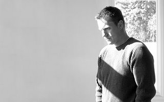
Well, I’m not sure where to start and I’m not a copywriter so I’ll keep this short. I’m a 30-year-old trapped in a 20-year-old mindset located in
Anyway, I hope you all enjoy what you read below. I answered all of these questions in a short amount of time so if it sounds like I don’t know what I’m talking about... I probably don’t know what I’m talking about…
When did you first decide to become a graphic designer/ illustrator? Was there a pivotal moment?
Like most here in the “Inspiration”, there wasn’t a pivotal moment. I was always drawing when I was a kid, cars and such. I was huge into skateboarding in my early teens and loved the artwork associated with it. I think it was around my junior/senior year of high school and we had a copy of Photoshop and I thought damn this is cool. It just did so many cool “tricks”. Little did I know that I would grow up to be one of the many haters of all the Photoshop tricks that people seem to use today! Can I get a drop shadow with an inner bevel please, oh, and add a lens flare on the side. Mmmmm tasty…
I knew that I didn’t want to do hard labor, number crunching was certainly out, I suck at math, and I didn’t want a standard desk job. So I guess that left me with design.
Who or what inspires you?
Everything. Design is not a 9-5 job like an accountant. I simply cannot turn of my design side. RDQ, aka. Steve Gordon, and I have had countless discussions about this. I’m always critiquing everything I see and it drives my wife nuts.
Magazines and books are a big inspiration as well. I wish I’d have known about all the resources that are out there now when I was in school.
Skateboarding is a huge inspiration for me as well. Many lunch hours are spent at the skatepark to help clear my head half-way through the day.
Finally, my family. It’s amazing how your kids can inspire you. Unfortunately as a designer, I get stuck in the “right” way something should look. Drawing with my oldest daughter with sidewalk chalk or sketching on her oversized Crayola notepad has loosened me up a bit. I’ll draw the perfect house with a tree in the front yard, a nice sidewalk, and then she will show me the “right” way to do it. It’s really teaching me to not be so constrained by what is “right”.
Where does your training come from? Self-taught? College/Art School?
So, primarily, I’ve learned from the masters. By masters, I mean the people that I’ve met along the way and fellow designers like you who are reading this.
How do you keep "fresh" within your industry?
Taking in the environment around me and trying not to get caught up in the trends. Looking through magazines, not just design magazines, can really get the creativity flowing. I do remember when I first saw stuff that 2advanced was putting out and I said “damn, I want to do that”, so I tried copying their style. No matter how hard I tried, I just couldn’t get my stuff to look like theirs. And if I did get something to look like theirs, I was like “shit, that looks just like the site they did for so-and-so. I can’t use that”. So I just started doing my own thing and grabbing bits and pieces from what I saw everyday. I think my style of design is fairly clean and, dare I say, corporate?! Up until two years ago I worked for corporations so that’s where I think it came from. I guess it’s more of a simple/clean style than anything.
What are some of your current projects?
Right now I’m mostly doing web work. I actually haven’t touched a big print job or logo in probably 3 months. Right now we are developing sites for Alegent Health, the Working Women’s Survival Show, Golden Harvest Seeds and a few others that can’t be mentioned due to legalities.
Which of your projects are you the most proud of? And why?
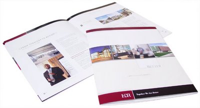
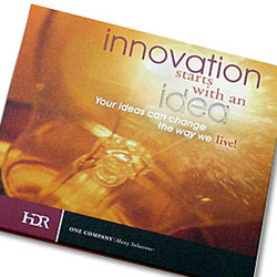
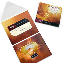
I’ve been most proud of my web work in recent years because it’s pretty much been through trial and error. Luckily I have a killer boss who knows the web really well so I learn a lot from him. I guess the biggest project that I’m still proud of is the recruitment site and CD that I did for HDR Architecture and Engineering back in 2002. It was my first big web/flash based project and I learned a ton from it. When I look back on it, there are soooo many things I would have done differently if I knew then, what I know now! :P I was also creative direct for the HDR Annual Report in 2002 so that was a big step in my career.
Currently though, I’m learning a shitload about the web in working with programming with Flash so it’s rewarding when you pick up something new. That’s the beauty of what we do, it’s never at a standstill and there is ALWAYS something new to learn.
Are there any areas, techniques, mediums, projects in your field that you have yet to try?
Not anything that I can think of other than expanding my web knowledge. Integrating Flash with the html and coding is something we are really getting into.
I’m not an “artsy” type in that I don’t paint or sculpt or anything like that although I sometimes wish I did. Two kids kind of eats up my time for learning new mediums.
Project wise, I really want to expand the side project that Steve Gordon and I have been working on called VNDK8 (see link below)
Any advice to the novice designer/ illustrator?
Put away your damn ego! I laugh at people who think they know it all when they get out of school. As I said earlier, when I graduated from college, I THOUGHT I knew it all. Yeah right. LISTEN to what experienced designers have to tell you and learn from it. And this goes out to those experienced designers who think they know it all. Put away your damn ego!!! You’re not the best thing since sliced bread no matter how much you think you are. Get over yourselves.
What makes a designed piece or illustration successful?
Man that’s a tough one. I could say the perfect combination of typography, photography and arrangement, but I’ve seen so many kick ass pieces that may only have one of those elements. Some of the coolest pieces I’ve seen have no photos at all, just very well laid out type. On the same note, you could just have photography. If it’s produced with the right technique, the correct color, the perfect cropping and the right paper, it can be the coolest. Take a look at photographer’s web sites. Most of them have very few words, but damn the layouts are clean.
One thing I’ve discovered in print is that proper color correction and kerning can make or break a piece.
What do you do to keep yourself motivated and avoid burn-out?
Enjoy my time with my family. Learn to take breaks. Do things other than design. Get up from the computer, sketch pad, easel, whatever, and do something else. Skateboarding and biking are a huge outlet for me.
And finally, what is the best thing on prime-time TV right now?
Oh man, I’m such a channel flipper. I’d say my fav would have to be SCRUBS. Unfortunately my daughters go to bed right around the time that most of the good shows are on so I help get them ready. I don’t have Tivo and programming the VCR is a pain in the ass so I miss a lot of good shows. Sad to say, but I’m an MTV junkie also. I love
My Links:
Corporate Express Sales Meeting Promotion
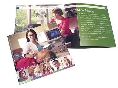
Nebraska Methodist College New Student Site
Erickson & Sederstrom Law Site
Sinclair Hille Architecture Site
Recent Work:
