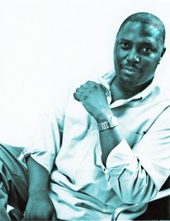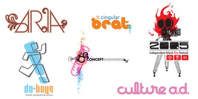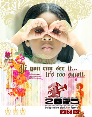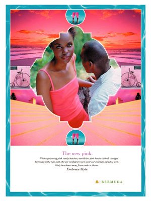
I’m Craig Brimm owner and creative director of Culture Advertising Design (www.culture-ad.com) we are a four - year old branding agency. Recently, we have been specializing in the ethnic health and beauty category, however we are not limited to that industry. We have completed a plethora of projects for clients such as The Bermuda Board of Tourism, Cingular Wireless, Coca-Cola, L’Oreal, Heineken, Colgate-Palmolive, and Procter and Gamble.
Branding is probably my favorite process to go through with clients. I love how we pour all the research and insights into one big bucket to come up with something new. I believe the design process unlocks those universal truths that can attract consumers to brands. I know that can be done for any product or service.
When did you first decide to become a graphic designer/ illustrator? Was there a pivotal moment?
This may seem a little strange maybe but as a kid I loved to watch reruns of “Bewitched”.
Yes, I had a childhood crush on Elizabeth Montgomery, there it’s out. However, something which was more intriguing to me was her husband Darren, no, not like that. I loved to draw and Darren had a job where he sat at a very cool old-school drafting table and drew all day long. Somewhere between the nutty mad-capped capers of being married to a witch with relatives who were full on warlocks, and having to deal with an incessantly disgruntled boss (Mr. Tate), there were plot lines for Darren and I realized “I could get paid for drawing”! It was many years later that I realized there were schools for this too, man, heck!
Who or what inspires you?
The sheer brilliance of great design. From the greats like the Eames’ and Ghery to Matisse and Picasso. By great design I don’t just mean visual design, I am also inspired by audio design or music, like the way Miles Davis single handedly changed the landscape of music no less than three times. I am inspired by cultural design as witnessed by the beauty, power and innovation of hip-hop. I have to say my greatest inspiration comes from God or nature, I think it’s currently under-going a White House sponsored re-branding effort and freshly labeled “intelligent design”. But what ever your beliefs are it’s undeniable the creativity behind something as simple and beautifully complex as a plant. It breathes in the air we’ve used and recycles it for continued life, through photosynthesis it feeds off of the most powerful and abundant energy in our solar system and it does all this without producing any negative environmental effects.
Where does your training come from? Self-taught? College/Art School?
My training came through all the usual channels, College, Art School, Tech School and exploration. However, there was one professor (we all have that one) who’s encouragement and support gave me direction. He was a tall sagacious fellow, sort of a Yoda meets Gandalf hybrid. He came of age in the 60’s, the golden era of advertising and insisted on teaching things that are mostly considered irrelevant these days. We had to draw entire fonts repeatedly, sketch before turning on the computer, create near perfect marker renderings and use one of the most oft forgotten tools of the trade, a concept. It all comes to bear years later and I still hear his voice “Luke use the force”, umm, “Craig start with thumbnails”.
How do you keep "fresh" within your industry?
I try to stay current by keeping my head tuned to the rest of the design community and the world at large.
Trade magazines, design books, the internet, music, television, I’m sick with it, the clinical diagnosis would be “Infomaniac”. But I believe that designer’s (myself included) relying too heavily on these materials can ultimately hinder more than help. Let me explain myself before we get a jones for the latest design annual and a case of the shakes from withdrawal. While these materials certainly inspire, they may dampen a designers “eye” or development of their own personal style. If we look at designers like Herb Lubalin, Saul Bass or Paul Rand we see definite voices. Ultimately, it’s our striving for less up to the minute “freshness” and more acurate visual messages presented in an authentic voice that will keep us all evolving and subsequently new.
What are some of your current projects?
We are currently working on a couple of package design projects. One is very corporate and “design by committee” so I’m embroiled in that classic design battle of creative versus suits. They actually have narrowed it down to a design we like but they are circling the wagons for the final shoot out. Another project is one we’ve taken on damn near pro-bono in exchange for more creative freedom, say wha.
Which of your projects are you the most proud of? And why?
I can’t really narrow it down to a project or two. I would have to say my career as a whole. Before working in the design field I had the opportunity to work a lot of different jobs; UPS, a bag boy, in-store merchandiser and even on a pig farm. However, once I began designing I really became alive. I was an intern in 1996 and by 1999 I became a Creative Director. I designed for a small agency who put me on the fast track. When I left there I did a career adjustment and went back to being an art director. Then in 2001, I went out on my own. I do feel most confident (proud) of my conceptual work both graphic and advertising, it’s the thread that delineates my career.
Are there any areas, techniques, mediums, projects in your field that you have yet to try?
I am very interested in developing products from start to finish. I get to paint the proverbial pig all the time but I’m very interested in creating more, something tangible, functional yet visceral. We have a few designs on the drawing table now. I had the opportunity to design my own desk, so I created a sort of Noguchi inspired look. Product conception and design seems to pull from all the arts. You see it in the building or honing of form like sculpture, the systematic or archaic plotting of design plus the adornment or affectation of color as an illustrator. I am hyped about that!
Any advice to the novice designer/ illustrator?
Heck yeah! Pick on the little guys, I’d love to... Nah, just kidding. They are the heart and soul of the arts with out their passion and untainted optimism these fields would grow very dim.
Study your craft. Consider yourself a professional from day one of art school. I cannot stress this enough. Be as professional as possible... a professional knows three things
1. What I am capable of doing.
2. How much time it takes me to do it.
3. What it’s worth.
Neophytes should remember it’s a small world made smaller everyday by technology and once you narrow it down to designers and illustrators that leaves us with about 37 people, just kidding there, but it’s a small group of us. So what I’m saying is a little corny but, be nice, treat people well and for goodness sake help others where ever possible. Lastly, when you blow up as some of you will, stay real.
What makes a designed piece or illustration successful?
The communicative nature of the piece. A chair should invite one to sit, through certain visual cues or maybe not at all, but once seated, a good design can impart an altogether different message. It can convey one of working, relaxation or just posing. A painting can emote a broad range of ideas and messages. A successful logo should in theory work through similar principles. However, if we look at the Nike logo while it certainly implies motion and maybe speed. It actually was the design of the marketing campaign that gave us the whole brand message and meaning.
What do you do to keep yourself motivated and avoid burn-out?
Motivation for me is found in collaboration with others, sharing ideas and in learning. I try and get away from my office and computer to relax and avoid burn-out. I get so geeked up on design, that even when vacationing I want to stay in a boutique hotel for the aesthetics.
And finally, what is the best thing on prime-time TV right now?
“My name is Earl” and “The Office”, Steve Carell is bananas !
Related Link:
www.Culture-ad.com
Recent Work:


